Guide: How to use the Urban Typologies
Their purpose
The four Urban Typologies identify and connect regions and cities that share similar challenges and opportunities, and thus foster collaboration and mutual learning, in some aspects of climate adaptation and mitigation. By grouping areas with comparable characteristics, the typologies make it easier to transfer effective solutions and best practices. They support urban planners and decision-makers in identifying relevant strategies and measures to accelerate progress in climate resilience and mitigation, offering valuable insights into the typical challenges, opportunities and key action areas within each cluster. The typologies consist of five to nine clusters each (see also "General overview of the typologies" and "Methodology").
The four typologies are: Contributions to Mitigation, Capacity for Action, Climate Hazards and Urban Morphology.
The indicators of the Urban Morphology typology are calculated exclusively based on urban areas in regions, while the indicators in the other typologies are calculated based on the entire area in the regions.
These typologies and indicator sets are four ways of grouping NUTS-3 regions (hereafter "regions") in Europe. Of course, other such typologies exist and many more are conceivable.
How to use the map, texts and graphs for each cluster
The following building blocks of information are available for each cluster. These building blocks are precisely the information basis for the user to fulfil the purpose of each typology or cluster and for what these typologies should be used for.
Map
Each typology, and each of its clusters, can be displayed on a map. A typology can be selected by clicking on its title on the map page. Each map consists of the regions which belong to a specific cluster, as well as the clusters constituting the typology displayed. You can use the maps to answer an abundance of different questions, for example:
- How common or rare the cluster is which the region of your interest belongs to
- Where else you can find this cluster
- Which regions in Europe are in similar situations to your region when it comes to each typology (the regions in the same cluster have the same color)
- Which cities or regions you can consider exchanging and collaborating with in regards, to similar challenges, opportunities and solutions
For each typology, an interactive map visualises:
- Spatial distribution of clusters across Europe
- Basic cluster descriptions ("overview") for each cluster
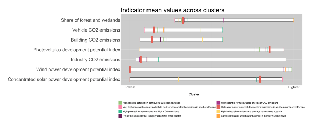
- Interpretation of key characteristics, in form of common challenges, opportunities and suggestions for action areas and solutions, for each cluster. In addition, for each indicator a table under "indicator values" provides a clicked region's actual values, the means of the cluster it is in and the means over all regions in the typology
These building blocks are described in the following, and clickable in the top right corner of the interactive map page.
What are some limits and limitations?
Across the EU, NUTS-3 regions largely vary in size and urban population
Regions are not units of identical size or population across the EU. Looking at the maps on this platform, it is quickly noticeable how the regions across the EU vary quite substantially in size. For example, they are far smaller in size and greater in number in Germany than in Sweden. At the same time, (total) population per region varies. In Germany, for example, it varies between under 100,000 and above one million, for some cases.
Aggregation of indicators to NUTS-3 level and conclusions for urban areas
Due to data availability of multiple indicators, the unit of analysis is NUTS-3 and neither cities nor grid cells with a higher spatial resolution than cities. All indicators were calculated and/or aggregated to NUTS-3 level – a well-established and useful level for comparison, because political decisions are also made on this level. However, the aggregation to NUT3-units as the unit of analyses invariably provides limitations to conclusions about the urban areas therein. Here is an example: The average of PM 2.5 air pollution in urban areas in a region could be well above a WHO recommended threshold and demand action, while rural areas could be below, and result in an aggregated, moderate NUT3-average.
Some indicators were used as proxies for certain complex characteristics due to data limitations
For example, the number of hospitals per 1,000 people was employed to represent overall healthcare availability, even though this metric does not fully capture the quality, accessibility or distribution of healthcare services within a region. Such proxy indicators, while useful for comparative purposes, may oversimplify nuanced realities and potentially overlook important contextual factors. Read more about which indicators as used as proxies in the methodology document.
Limitations of specific indicators
Some indicators have specific limitations, despite being the most appropriate pick to the best of our knowledge. One example is the vulnerable age groups indicator in the capacity for action typology: The indicator has a limited definition of vulnerable groups does not include people with disabilities nor women (especially when pregnant) who also need special attention when formulation and implementing policies.
Climate Hazards typology
The indicators for this typology largely focus on exposure of people to specific climate hazards. However, the study does not investigate overall climate risk. To do so, it would be necessary to analyse vulnerability, adaptive capacity and link all four. This would have been beyond the scope of the study. For each hazards, only one indicator was used. Each one respectively indicates, for example, exposure or hazard. In addition, the indicators focus on data on current or recently observed hazards. However, there is an exception, namely the wildfire indicator, which used climate projections based on the RCP 8.5 scenario for the time range 2070-2100.
Note: you can find further information about the Urban Typologies on the MOOC How to Build Carbon Neutral, Resilient and Just Cities, within Module 4 "UP-Scaling" --> "3. Tools to Achieve UP-Scaling" --> "Urban Typologies Tool".
